

If you’ve tried to visualize your data with a map, you know how time-consuming it can be. With choropleth maps you often need specialized and complex tools just to get started.
It shouldn’t take so long or be so difficult, so we built MapInSeconds.com, which takes your data and generates a map - in seconds. The tool is free, there’s no sign-up required, and you can save the map as an image or a PowerPoint slide with the click of a button.

Our tool makes creating area-value maps, otherwise known as choropleth maps, a quick and easy process.
The major challenge in keeping the tool simple is in building an experience that addresses complexities invisibly. Here are some of the things we've integrated to improve the user's experience:
Easy, Automatic Map Selection

MapInSeconds.com automatically chooses the map you need based on the data you have. It analyzes the keys in the left column of data , and selects the map that best matches those keys. Of course you can always manually select a specific map.
Furthermore, colours for political, non-numeric data are automatically chosen for the United States and Canada. For example, non-numerical data like "NDP" or "New Democrat", "Conservative" or "PC", "Liberal", "Bloc", "Greens" have political colours automatically assigned to them for Canadian maps.
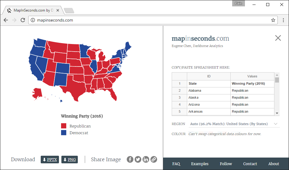
Regions at the U.S. state or county level are assigned political colours if your data values are "R" "Republican", "Republicans" or "GOP". The same goes for "Democrat", "Democrats", and "D".
Maps, Maps, and even more Maps

Over 600 city, regional, and country maps exist on MapInSeconds.com, and more are expected to follow. For each an appropriate projection has already been chosen. You can search the list of maps through the "Region" section of the tool and copy the provided sample data for each map.

Among other geographic classifications, U.S. Census Zip Code Tabulation Areas have been incorporated into the tool. We're also looking into the 3 Digit Postal Codes and Dissemination Areas across cities and provinces in Canada, and we've started with Edmonton and Alberta.
Map Design Best Practices
The tool was inspired by our conversation on making better, clearer maps, and it’s no surprise that it incorporates several best practices on map design. Map-safe colours are utilized, and the data is classed for better readability. Additionally, the tool creates a legend that is easier to read: instead of seeing limits of 1.395482 and 993.29123, you might get a limit of 0 and 1000. It also determines if your data has outliers, and adjusts the legend to ensure they don’t disproportionately weight the colours of your map.
Designed For Reports and Presentations
Saving or sharing the image happens with the click of a button, and the settings section on the right can be hidden for more screen real-estate. Both the map and legend are movable and zoomable, and you can change map colours with a single click.
This gif demonstrates how a user can create a map, style it, move the visuals, and save the map as an image to be used for reports or presentations.
Finally, the data itself is never saved on our servers, so it’s safe to use with your private data.
What's Next
Depending on the interest and use of this tool, we’ll consider adding new functionality and more maps. Do you want custom colour palettes or adjustable class bounds? Are you looking to make bubble maps or point maps or flow maps? Do you need embed-able maps? Let us know.
If you have suggestions for new features or new maps, you can reach us at mapinseconds@darkhorseanalytics.com. You can also sign up on our MapInSeconds.com mailing list to be updated on any improvements.