


In Stephen Few's latest newsletter he proposed a new method for displaying geospatial data. Not long after, based on feedback from Andy Cotgreave and others, he expressed his disappointment with breadth of applications for which the technique seems useful. What Few has done though is generate new interest and discussion for expanding and improving our methods for plotting data on maps.
Stephen worked with Panopticon to produce this comparison tool (which is now a dead link), but it is limited to three shapes. I wanted to compare more, so I put something together. Below are several of the outputs for comparison.
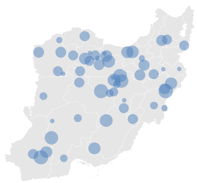
First we'll start with the bubbles that bricks were intended to replace. Seeing overall geographic patterns doesn't require much effort, but distinguishing between any two points of similar size is difficult especially in the bigger circles. However, when things begin to overlap geographic patterns remain visible and locations of the points can still be determined.

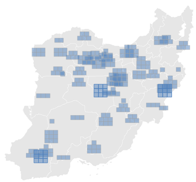
With bricks we can see overall patterns, and distinguish between any two points quite easily, but when things have considerable overlap the location of points becomes lost, and geographic patterns are harder to make out. Bricks also have the disadvantage of breaking things into groups of nine which is awkward in our base 10 world.

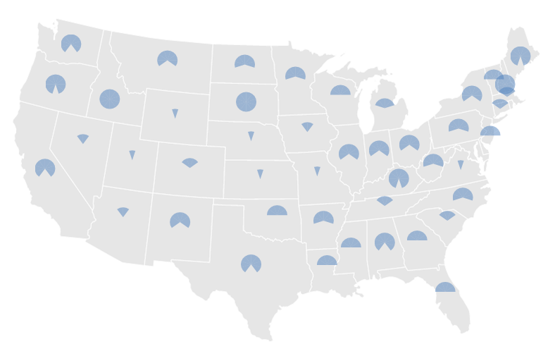
I thought I'd try out pie slices, which seem to my eye a little less effective at quickly distinguishing magnitudes than bricks, but slightly easier than bricks at pinpointing the geographic location it is associated with. They can be also partitioned into groups of 10 or any other appropriate amount. They are however, similarly poor when they begin to overlap.

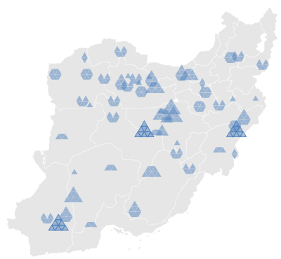
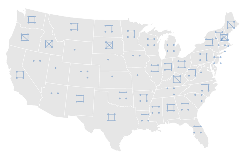
Triangles seem comparable to bricks but, like bricks, have the disadvantage of adding up to nine and being difficult to differentiate and pinpoint when overlapped.

I also tried Tukey Tallying which is clearly not suited for this task in any way.

One of the most promising results of the discussion Few initiated was the latest iteration of Francis Gagnon's concentric circles technique. Despite Few being rather dismissive of their value in his discussion board, I think they improve bubbles without any of the drawbacks that Stephen's bricks create. They may not be as preattentively recognizable, but I'm not sure that is much of a disadvantage for most purposes. I recommend reading these three posts where Francis outlines his thoughts at each iteration of their creation.


One further option I created, inspired by Gagnon's circles and this image, is what I call ingrowing circles. Differentiating between two different circles in this manner seems easier to my eye than standard bubbles, but not as effective as Gagnon's circles. Overlapping and locating the points is easier than bricks and there is no limitation on how many segmentations can be applied. Certain data sets or design aesthetics might find this method useful, though the concentric circles technique seems the most effective for the general case.


While Stephen Few went for wholesale change with a completely new methodology, I think the most progress was made with the incremental improvements of Francis Gagnon's concentric circles. What are your thoughts on these and other alternative methods? Let me know if you have a new and creative option to throw into the mix.