
Educational Animated GIF
About
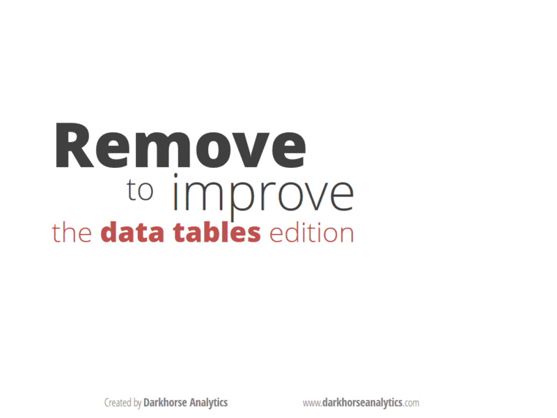
Data Looks Better Naked is a series of animated gifs that help people present data more simply and more effectively. The table version (left) is the specific one being referred to here, with more GIFs in the series.
Notable Information
Over 2 million views and counting.
Series GIFs, including the Graph and Map type, have Frontpaged on Reddit, hit #1 on r/GIFs, r/DataIsBeautiful, and r/Minimalism.
Constantly shared across Twitter and included in teaching material, including videos.
Viral Tweet of a Growing City
About
Animating a century’s worth of growth for the city of Edmonton, Canada, by visualizing the buildings built per year.
Notable Information
Tweet went viral for Edmonton, a population of about 1 million. Retweeted 650 times, which compared to the typical Top tweets for #yeg is extremely high.
Viral tweet led to a request for an interview, culminating in an article on the CBC.
Visually Engaging Tool

About
WorldChatClock.com is an interactive tool that makes it easier to find suitable meeting times between participants living in different cities/continents.
Notable Information
Frontpaged on Reddit, hit #1 on r/DataIsBeautiful with more than 2.1k upvotes (this is a large amount before Reddit decided to unobscure and suppress real upvotes).
Animated Video of San Francisco’s Growth
About
A prototype map animation showing the growth of San Francisco via the buildings built from 1900 to 1970.
Notable Information
Frontpaged on Reddit, hit #1 on r/DataIsBeautiful with more than 17.3k upvotes.
Interest helped spawn a more polished version for a different city (Edmonton), shown earlier.
Simplified Map-Making Tool

About
MapInSeconds.com allows users to make choropleth maps in seconds, all by pasting spreadsheet data into the tool. No map knowledge required.
Notable Information
Frontpaged on Reddit, hit #1 on r/InternetIsBeautiful with more than 15.0k upvotes.