

Visualizing.org is currently running an Olympic games visualization challenge. You can view all of the entries here and vote on them if you like. The contest has 3 criteria: Understanding (10 Points) How effectively does the visualization communicate? How well does it help you make sense of this issue? Originality (5 Points) Are the approach and design innovative? and Style (5 Points) Is the visualization aesthetically compelling? One of the entries is from Andy Kirk a data visualization consultant, designer and trainer who runs the excellent Visualising Data Blog. Together with his colleague Andrew Witherley, Andy submitted The Pursuit of Faster, an interactive piece that allows you to explore the performance improvements in timed Olympic events. I encourage you to click on the link and explore the visualization before continuing with the post.
Their submission is my choice for the best interactive primarily due to the its strength in making sense of this interesting topic. Most of the other interactives either provide limited information and insights or are too cumbersome to allow those insights to come to the surface. A couple are simply data art and while they are attractive to look at they don't effectively communicate much beyond their own artistry.
In addition to his entry and description of the project, Andy was kind enough to post about the design process providing an excellent view into how he approaches and assesses his work.
The centerpiece of Andy's project is a straight-forward line chart that displays the medal times. A shrewd decision on their part was to flip the y-axis so that faster times appear higher on the scale, putting gold above silver and making the Olympic record stand out as the highest point.

Hovering over elements provides the athlete and their time and clicking brings up a dialog with more information. The project uses a simple color palette that is easy to interpret and eliminates most of the need for legends. A table outlines medal counts in the event by country and supplementary charts allow you to compare the event's percentage improvement over time against those of related events as well as showing related analyses.
While this is my favorite submission, I still think there is considerable room for improvement. Andy readily admits that his design did not achieve much in the way of Originality. For me, its Style, while clean, is not particularly engaging. Improvements could be made that would also add to the Understanding component.
For all the attention to de-cluttering the design, I found that the lines for each medal on the first chart still left me with a feeling of clutter especially where the lines are clustered close together. This could be remedied by simply removing the lines for silver and bronze while leaving their points visible.
Sometimes the effort to minimize gridlines and labels goes a little too far. There is no context for the times in the line chart until we hover over an element. Also, when initially revealing the Event Analysis section we are presented with these charts which have no hover functions:
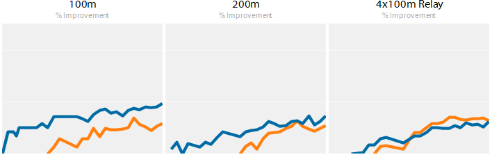
It is not until we expand the Sport Analysis section that we are able to decode the gridlines as representing 20 and 40 percent and even then the 20% is only implied and the 40% visible on only one chart. A little extra labeling could ease the user’s interpretation of these charts without adding clutter. To remove more clutter the "% Improvement" subtitle that sits atop each chart could be placed in an overarching section title. This would have the added benefit of providing more clarity than the currently ambiguous "Event Analysis and Comparisons" and "Sport Analysis and Comparisons" titles.
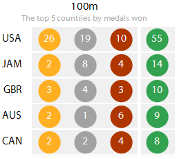
The Event section starts with a multi-colored table listing medal counts. The brightness of colors and the addition of green to the palette is somewhat distracting. Putting the data in a table format also limits our ability to quickly compare the magnitudes. The US dominance in the 100m would be far more apparent in a graph of some sort.
The three improvement charts in the Event section are duplicates of charts found in the Sport section and it is not clear why they are placed here. I actually spent time looking to see if there was some difference I was missing. If there is, I couldn't find it. Perhaps this was an attempt to provide a more prominent place for what were considered the most relevant comparisons, but this is better achieved by sorting the improvement charts in the lower section and even removing some of the less relevant ones.
The Sport Analysis section leads with a chart whose relevance to the topic is questionable.

Andy states that "The purpose of this visualisation is to consider how enhancements in coaching, technology, fitness, training, physique and sports science in general have influenced the improvements in performances? How much closer are women to reaching the performance levels of men? How much faster do the trends suggest athletes can go?" These are excellent goals, however the 'Top 5 Winning Margins'chart does little to help us get there.This could be an interesting analysis, however, there is not enough context with a single chart to really provide any new understanding.
Likewise, I found the two 'Top 5 Event' improvement charts were more points of interest than valid comparison with the current event. The comparison charts are more relevant and informative and should be given more prominence than these two.

The final Event Data section could be removed entirely and not impact this interactive's usefulness at all. This seems like a feature that was implemented because the technology made it possible, not because it was a valuable part of the overall design. Viewing the data records ten at time - even with the ability to drag and group by categories - is a tedious way to further explore the data. The table also neglects to provide the athletes' names. A simple link to a spreadsheet or file containing the data would be far more useful for those interested in inspecting the details.
Overall, the somewhat sterile look of the page while effective in a corporate decision making environment, does little to invite and engage in an online interactive where the audience wants flair as well as insight. It is possible to provide this without reducing the effectiveness. In fact, an engaging style may also bump up the originality of the piece as plain line charts are quite common (though less common than ugly line charts), but you have to be somewhat innovative to engagingly style a line chart.
It's somewhat easy for an outsider to assess the visualization and nitpick about details, but what would a revised version of this tool look like? I've mocked up a redesign in excel that addresses what I felt were the biggest shortcomings of this visualization. In it I stole liberally from the color palette of one of the other entries which is quite pretty, but not very useful. I could not have created this redesign from scratch, Andy and Andrew's idea and work was the difficult part, and the color palette was not my own, but I think these tweaks would result in a more engaging and valuable tool.

Click image for the full size.
Note: Data for the 200m, 400m, and 800m comparison charts was fabricated for this mock-up.
Besides changing the colors and font, the lines for each medal were eliminated leaving just the dots. The interactivity to toggle lines on and off would be changed to highlight one set of medals or the additional 'Record' trend which links the times when records were broken. This allows for a nice clean look at the outset that makes observing the trend simple. Fewer gridlines and borders are drawn on the line chart to further reduce clutter while small labels on the y-axis provide context and remind that the axis is flipped.
The tabs at the top have been abandoned for a set of hierarchical links. An extra level of hierarchy was added to focus the set of events that are shown and compared. The listing of each event no longer takes such a prominent and permanent position in the visualization, removes the need for the nested set of tab borders, and limits the amount of real estate occupied with selection devices.
What was formerly the event analysis section is shown from the outset rather than making the user click to see the charts. The section now focuses on information about the selected event and leaves comparison to the section below. The top five times for males and females are shown with details including the medal type which reinforces the improvement in speed as we see some of the top athletes are not gold medalists.
The dotted table is now a chart that still allows you to see the details but gives much quicker recognition to the magnitudes of the differences between countries. A stacked bar makes to two most interesting data points (gold count and total) the easiest to interpret.
Improvement comparisons were limited to the selected event and the three events I considered most relevant. This more digestible number of charts is not as overwhelming as the original. Interaction could be added to allow the user to select specific events to add to the comparison. Labels highlight the improvement as of the most recent year in each providing some of the detail that used to exist in the 'Top 5 Events' charts. A 20% label has been added to the grids of the first comparison chart and the title of the section makes the differentiation between men and women clear from the outset.
The 'Top 5 Margins' was removed for the reasons stated above. The two 'Top 5 Events' charts were also eliminated. These served mainly to indicate interesting events to look at, but were often of little help when comparing to the selected event. Links at the bottom now serve to direct the user to some of the events that have made the greatest strides since their introduction, completing a layout that starts with details about the selected event, moves to comparisons with closely related events and then links to other less related events.
Andy is deservedly well respected in the visualization community, but even the experts can find room for improvement. I suspect The Pursuit of Faster suffers from the drawback of faster and that time constraints prevented Andy from making many of the improvements he might have wished, but a bit more care with the design could have helped create a piece with more impact.