

There is a near infinite variety of visualization methods within our field. Santiago Ortiz’s article, 45 ways to communicate two quantiles, shows us a stunning expanse for just two numbers. FlowingData has given us 9 ways to visualize proportions and 11 ways for changes over time.
Many charting taxonomies include distributions, but they only present a few options. Let’s remedy that with a post on the many. We’ll use a single (completely fake) data set so we can easily compare how each chart type displays the same data.
Plot the Data
To start, just plot the data against a scale. These charts are useful in conveying the volume of observations as well as the distribution, but can quickly become messy and hard to read as the size of the data set increases. They give a great sense of the range or spread of the data and can highlight clustering.
Barcode Chart or Rug Plot

Just a simple line plotted for every point, usually with some transparency or a colour scale to deal with multiple points of the same value.
Barcode charts to check out:
The New York Times shows Michael Phelps's times
The Washington Post on metro performance
The Upshot on income change
Strip Plot

Much like the Rug Plot but with circles or dots instead of lines. It’s very compact but as a result can feel crowded as the number of points increases.
Strip plots in the flesh:
NPR looks at school funding
The LA Times on pop music’s evolution
Eurostat’s key European statistics
Jittered Strip Plot

To reduce the amount of confusion due to overlap, this plot moves points up some random amount on the vertical scale.
Jittered strip plots in all their glory:
Orchard visualizes loan principal amounts
Andy Cotgreave’s Chart of Biology
Aware looks at personal productivity
Bee Swarm Plot

This plot spreads things out even more than the jittered to completely avoid overlap while still plotting the points at their precise location on the scale. This makes reading each value easier but limits the number of points you can plot before things get out of hand.
Beeswarm plots in the wild:
Bob Baxley plots FM radio stations
Flowing Data compares incomes
Gerardo Furtado visualizes CO2 emissions
Bin the Data
If the individual data points get a bit confusing or your data volume gets large, you’ll want to look at binning your data. These visuals give a great sense of the shape of your data, where values typically fall and what is most likely. They give up some precision in the process, however.
Unit Chart

If we take the beeswarm plot and organize the dots into bins of ten, for instance, we get a unit chart. Like the previous charts, unit charts can give a sense of volume if each represents a single point or some round-numbered multiple.
Unit charts out on the town:
ProPublica on changes in workers comp
South China Morning Post show Hong Kong Marathon results
People are units too
Histogram
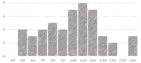
If you draw rectangles over top of the unit charts, you get the chart synonymous with distributions, the histogram. It works with any number of data points, just scale its axis to accommodate the larger count. Choosing the right number of bins can have an impact on how any of these charts look, but a bit of experimentation usually leads to a reasonable answer. The histogram's familiarity makes it quick to interpret for many.
Histograms in the real-world:
The New York Times looks at marathon run times
Todd W. Schneider analyzes reddit front page rankings
We take a look at uniform distributions
Area Chart
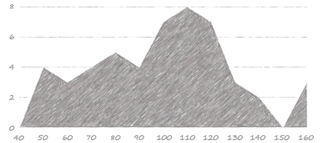
You might be tempted, as I was, to call this a density plot, but density plots actually involve some fancy math to estimate a distribution from a sample, whereas this just plots the bin totals. Consider using the area chart when the shape and pattern of the distribution are more important than the actual values in the bins. Or when it just suits your aesthetic better.
Area chart distributions in the wild:
FiveThirtyEight looks at the political spectrum in law schools
The Financial Times gets creative with win and loss distributions for Nadal and Federer
David Taylor breaks down English letter positions
Line Chart

Sometimes called a frequency polygon when the lines are straight, this is still just a slight variation on the histogram using a line connecting all bin totals rather than a bar for each. Line charts (and sometimes area charts with a significant amount of transparency) are excellent for comparing a few different distributions on the same scale.
Line chart distributions on display:
OkCupid exposes lies about height among other things
Ben Willer’s personal television viewing
El Español compares political parties
Stem & Leaf Plot

It’s a sideways histogram, but with all the data encoded in it. Once you know how to read it, it is quite powerful. In this example, the first row is the 4 data points in the 50’s from our data set: 52, 55, 55, and 57. It’s only useful for smaller data sets, but I wish I saw it more often. R will produce these quite easily but, sadly, few other tools do the same.
Stem & leaf plots in their natural habitat:
Japanese train departures
A paper looking at the impact of adventure programs in education
Bean/Violin Plot
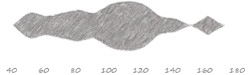
Like the area chart except symmetrical and usually more compressed. This is often useful when comparing multiple distributions where a sense of the shape is important. They frequently have additional plotting superimposed: violins with a box plot that makes them look a lot like a violin and beans with a rug plot that makes them look nothing like a bean.
Bean plots abroad:
Periscopic analyzes grants
Bill Mill looks at Boston marathon run times
Heatmap

Heatmaps are extremely compact and excellent for looking for patterns across many distributions. They use variation in colour to show the counts and, as such, they are not very precise, only giving a crude sense of the data’s shape. Gradient plots are a sort of smoothed version of a heatmap.
Heatmaps in operation:
The Washington Post on presidential approval ratings
Nick Berry analyzes four digit PINs (scroll past the histograms)
Seth Kadish shows us chess board utilization
Summarize the Data
These plots simplify the distribution by focusing on a few key aspects of the data, usually some measure of central tendency plus some measure of range. They can be easier to deal with when comparing multiple distributions.
Box Plot

Box Plots focus on the min, 25th percentile, median, 75th percentile and max. Most will explicitly plot outliers and exclude them from the min-max. Nathan Yau has an excellent post on reading and using box plots. Even though it simplifies our distribution, it is still quite powerful, revealing skews and outliers as well as range and central tendency.
Box plots out and about:
FiveThirtyEight looks at the Red Sox roller coaster
The Washington Post on Ivy League grad earnings
Marcus Beck analyzes theses lengths
Min Max Average Plot
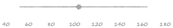
The ends of the line show the minimum and maximum of your data and the dot shows the average, or really any three metrics you find most useful. If the range of the data is the most important thing to convey, or you are concerned about your audience’s ability to interpret some of the other plots, this can simplify things considerably by focusing just three numbers that most people are familiar with.
MMA Plots in action:
FiveThirtyEight with a great story on name based age estimates
Flowing data plots the 10th, 90th percentile, and median of industry salaries
The Washington Post boils it down to the minimum and maximum age in Olympic sports
Stacked Bar

This plot involves a change in perspective. It has a much smaller number of bins and shows the proportion of the data that fits in each. It will provide a very coarse look at the shape of the data but is quite easy to interpret. It is useful for comparisons across distributions when there is less nuance in your data or if the data was collected without much precision. It is most effective with a small number of categories.
Stacked bars in use:
Seth Kadish visualizes charity ratings
The Government of Canada shows small business owner ages
We rework social media demographics
Rank the Data
With these variations, we are back to plotting all the data, but this time we use one axis to plot the values and another to plot the ranking. This gives a different perspective on the shape of the data. These are excellent at providing context for where one data point fits in among many, but as they can take up a considerable amount of space they may not be suited for comparing many different distributions or for very large data sets.
Ranked Bars

This is one of my favourite ways communicate a single distribution while highlighting a particular data point. Because people love to rank things, it’s very easy to interpret. It behaves in almost the opposite manner to a histogram in that flat areas represent clusters of data whereas with a histogram it is the peaks.
Ranked bars IRL:
We take a look at school grades
The OECD Better Life Index compares countries
Density Design looks at cesarean sections across the world
Quantile Plot
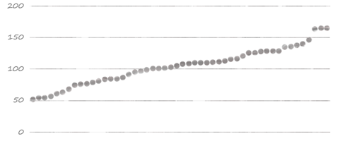
Quantile plots can feel lighter or less cluttered than the ranked bars, but it can be harder to highlight a single data point. You can also calculate each of the 100 percentiles and plot them rather than plotting each and every point. Great for answering the question “what percent of my values are below/above a certain threshold?”
Quantile plots in real life:
Honestly, I’ve never seen them anywhere but in Stephen Few’s article on distributions displays. Give it a read for a much more in-depth discussion of quantile plots along with box plots, histograms, line charts and strip plots.
Combine Them
Of course, you are not limited to any single one of these charts when exploring or communicating your data. The advantages of one plot can be leveraged against the disadvantages of another. Variations on box plots are often superimposed on other charts, rug plots combine well with histograms, rotate and mash two histograms together, and you get a population pyramid. You’re sure to imagine good combinations of your own once you start exploring them.
Combinations in operation:
John Nelson combines a table, a heatmap and two histograms in his alien sightings graphic
The Financial Times combines a line with a histogram for comparing income
Stephen Wolfram’s personal analysis uses a variety of distribution plots throughout
This list is by no means exhaustive. I’ve left out animated simulations, but you can read about one form of them, HOPs, and an associated critique. I’ve only seen horizon charts used for time series, but I bet you could compare distributions with them as well.
For your convenience we've put together a handy one pager of all these methods. If you know of additional ways to visualize distributions, please share an example in the comments.
