
Visualization is not a straight path from vision to reality. It is full of twists and turns, rabbit trails and road blocks, foul-ups and failures. Initial hypotheses are often wrong, and promising paths are frequently dead ends. Iteration is essential. And sometimes you need to change your goals in order to reach them.
We are as skilled at pursuing the wrong hypotheses as anyone. Let us show you.
We had seen the Hierarchical Edge Bundling implemented by Mike Bostock in D3. It really clarified patterns that were almost completely obfuscated when straight lines were used.

We were curious if it might do the same thing with geographic patterns. Turns out Danny Holten, creator of the algorithm, had already done something similar. But we needed to see it with our own data.
We grabbed some state-to-state migration data from the US Census Bureau, then found Corneliu Sugar’s code for doing force directed edge bundling and got to work.
To start, we simply put a single year’s (2014) migration data on the map. Our first impression: sorrow, dejection and misery. It looked better than a mess of straight lines, but not much better. Chin up, though. This didn’t yet account for how many people were flowing between each of the connections — only whether there was a connection or not.

Unweighted edge bundled migration
With edge bundling, each path between two points can be thought to have some gravity pulling other paths toward it while itself being pulled by those other paths. In the first iteration, every part of a path has the same gravity. By changing the code to weight the bundling, we add extra gravity to the paths more people move along.

Weighted edge bundled migration
Alas, things didn’t change much. And processing was taking a long time with all those flows. When the going gets tough, simplify. We cut the data into two halves, comparing westward flows to eastward flows.

East to west migration

West to east migration
Less data meant cleaner maps. We assumed there would be some obvious difference between these two, but these maps could be twins. We actually had to flip back and forth between them to see that there was indeed a difference.
So our dreams of mindblowing insight on a migration data set using edge bundling were a bust. But, seeing one visualization regularly leads to ideas about another. We wondered what would happen if we animated the lines from source to destination? For simplicity, we started with just eastward migration.

Lasers
Cool, it’s like laser light leisurely streaming through invisible fibre optic cables. But there’s a problem. Longer flows appear to indicate higher volume (which is misleading as their length is not actually encoding volume, just distance). So we tried using differential line lengths to represent the number of people, sticking with just eastward flows.

Star Wars blasters
Here we get a better sense of the bigger sources, especially at the beginning of the animation, however, for some paths, like California to Nevada, we end up with a solid line for most of the loop. The short geographic distance obscures the large migration of people. We wondered if using dashed lines would fix this—particularly in links like California to Nevada.

Machine gun bursts
This gives us a machine gun burst at the beginning with everything draining into 50 little holes at the end. We get that sense of motion for geographically close states, but the visual doesn’t match our mental model of migration. Migrants don’t line up in a queue at the beginning of the year, leaving and arriving at the same time. Their migration is spread over the year.
What if instead we turn the migration numbers into a rate of flow. We can move dots along our edge bundled paths, have each dot represent 1000 people and watch as they migrate. The density of the dots along a path will represent the volume. This also has the convenience of being much simpler to explain.

Radar signals
We still have a burst of activity (like radar signals) at the beginning of the loop, so we’ll stagger the start times to remove this pulsing effect.

Staggered starts
Voilà. This finally gives us a visual that matches our mental model: people moving over the period from one state to another. Let’s add back westward movement.

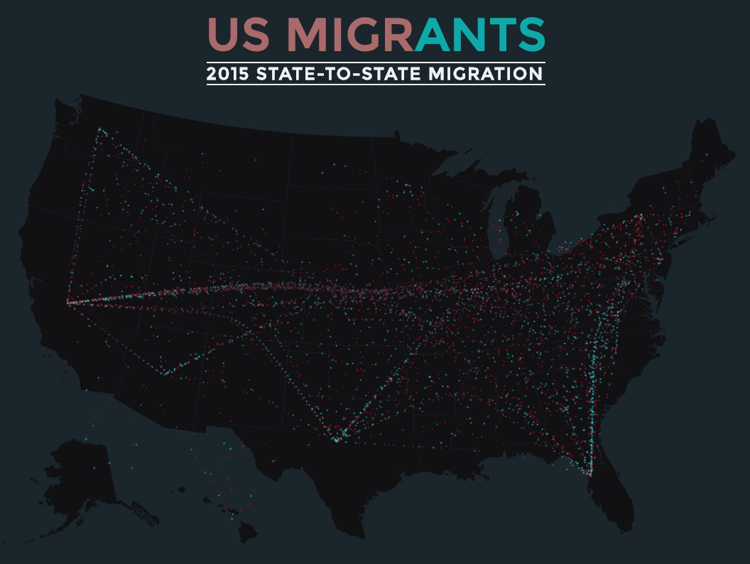
Ants
Very cool, but with so much movement it’s difficult to tell who’s coming and who’s going. We added a gradient to the paths to make dots appear blue as they leave a state and orange as they arrive.

Coloured ants
Let’s be honest, this looks like a moderately organized swarm of ants. But it is a captivating swarm that people can identify with. Does it give us any insight? Well not any of the sort we were originally working for. No simple way to compare years, no clear statements about the inflows and outflows. If we want to make sense of the data and draw specific conclusions… well other tools might be more effective.
But it is an enchanting overview of migration. It shows the continuous and overwhelming amount of movement across the country and highlights some of the higher volume flows in either direction. It draws you in and provides you with a perspective not readily available in a set of bar charts. So we made an interactive with both.
Each dot represents 1,000 people and the year's migration happens in 10 seconds. Or if you'd prefer, each dot can represent 1 person, and you can watch the year play out in just over 2 hours and 45 minutes. If you’re on a desktop you can interact with it to view a single state's flow. And of course for mobile and social media, we made the obligatory animated gif.
And just when we thought we'd finished, new data was released and were were obliged to update things for 2015.

Glowing ants
Building a visualization that is both clear and engaging is hard work. Indeed, sometimes it doesn’t work at all. In this post we’ve only highlighted a fraction of the steps we took. We also fiddled with algorithm settings, color, transparency and interactivity. We tested out versions with net migration. We tried overlaying choropleths and comparing the migration to other variables like unemployment and birth rate. None of these iterations even made the cut for this blog post.
An intuitive, engaging, and insightful visualization is rare precisely because of how much effort it takes. We continue to believe that the effort is worthwhile.