

Based on a talk given at Lunchalytics in 2018.

In visualization we have a vehicle capable of more than just communicating numbers.

This is Wilhelm Von Osten, he was an elementary math teacher from Germany in the early 1900s. But like many bearded math teachers, he dreamed of more. Von Osten believed animal intelligence was underestimated, and that little bit of crazy in his eyes gave him the courage to pursue this belief further.

He set about trying to teach math to animals. Some accounts have him making efforts with other mammals, but it was his horse, Hans, who seemed to show both interest and aptitude.
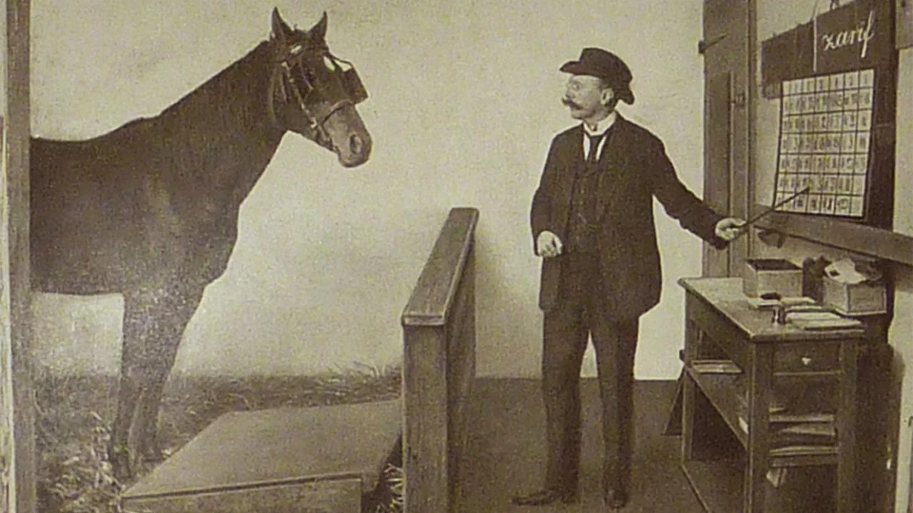
Here we see Hans in the classroom practicing his craft, his efforts eventually earning him the moniker ‘Clever Hans’.

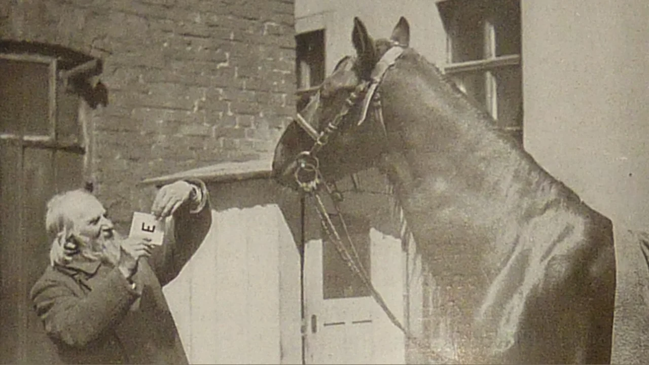
Following his tutelage, Von Osten took Hans on tour to demonstrate his math wizardry. Asked “what does two plus two equal”, Hans would tap his hoof four times. “The square root of nine?”, three taps. Hans even appeared to grasp the concept of time, with five taps answering “if today is Monday, how many days till it is Saturday?”

Now the German people are a stereotypically serious, no-nonsense group of individuals and, as such, the German Board of Education put together an entire commission to conduct an investigation into Hans’ mathematical abilities. The man who led that commission was psychologist Carl Stumpf.

Stumpf had previously investigated Hans, looking for evidence of deception or trickery on Von Osten’s part. He found none. But this investigation was to be more thorough. They removed Van Osten from the equation and Hans was still able to answer questions.
But problems arose when the questioner was far away from Hans, or out of the horse’s line of sight altogether. Similarly, when the individual asking the questions didn’t know the answer themselves, Hans also struggled.

It turns out that Hans didn’t know how to add. His skill was something even more impressive. He was actually reading the subtle nuances and emotional tells in the questioner’s face and movements. He could identify the expectation and hope of more hoof taps along with the relief or satisfaction of a correct count. Reading those cues, cues that the audience and even the questioner weren’t aware of, allowed Hans to respond accurately.
In the decade and a half that I’ve been married, I still struggle to pick up on cues of tension and expectation from my wife, yet this horse could intuit them even with strangers.

Much as Von Osten didn’t recognize Hans’ real talent, sometimes we too are blind to the strength of visualization because we’re so enamored with its capacity for numbers. We see how visualization can convey the most information in the shortest amount of time and we focus on that. Yet we miss its ability to arrest an audience not just for the information it conveys, not just for the beauty it encompasses, but for the feelings it can impart, the questions it can encourage, and the actions it can provoke.

Visualizations captivate and induce wonder. Wonder in both senses.

National Geographic’s visual of immigration patterns in the US over time may not be the most effective tool if we have a specific, predefined list of questions about immigration. But it draws us into the data with the familiar metaphor of tree rings. It encourages us to ask more questions. To ponder what we might have ignored.

Visualization can take us beyond the sedate accounting of data and into the lives of the people behind it.

This animated visual from the New York Times brings to life the results of research on economic mobility in the US. Please read the article if you haven’t already. The animation shows just 10 numbers. But in this form it doesn’t just engage you, it humanizes the data. By simulating the paths and making explicit the movement on the income ladder, we can more easily identify with the individual lives that are impacted.

Interactive visualization can also give viewers control and a sense of ownership over the new knowledge they’ve acquired.

Vi Hart & Nicky Case’s Parable of the Polygons uses interactive visuals to give us agency as we come to understand the numbers underlying this theory of segregation. In doing so we are more invested in the results and more likely to internalize the message and maybe even bring it up in our next conversation.
Van Osten never fully accepted the commission’s conclusion on Hans’ abilities. It didn’t match his perception of animal intelligence. He wasn’t able to see the true revelation: he didn’t have a mathematical horse, he had a mind-reading horse.
We must be careful to not do the same with visualization. Sure our visual processing can speed up our capacity to take in numbers, but don’t lose sight of the other, possibly more powerful, virtue in visuals: how they engage our emotions, in ways we may not even be aware, to affect wonder, empathy, and even change in our actions.