

With the announcement a couple months ago of steep cuts to StatsCan’s budget, it seems a post about the value of the data they provide, and hopes that its quality will not degrade, would be in order. Unfortunately, that kind of post isn’t much fun so instead I’m going to kick ‘em while they’re down. Let’s rephrase that: Instead I’m going to offer them some free charting counsel. Should someone from StatsCan ever stumble across this blog, I hope they find it helpful. StatsCan generously provides a life expectancy report for Canada. It is not incredibly engaging but it does have links to charts which increase both interest and understanding. Or they could if they didn’t suffer from so many problems. Setting aside that the charts are not shown in line with the narrative; let’s take a look three of the graphics, all bar charts, in detail.
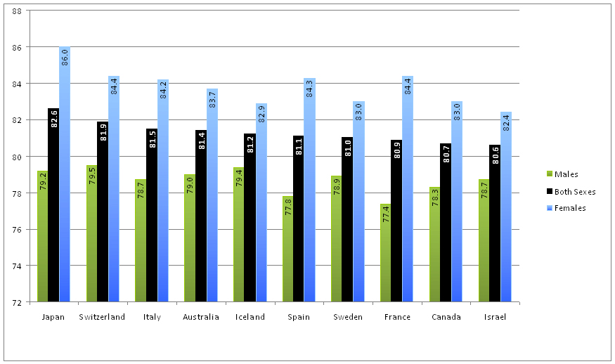
Life expectancy at birth, top 10 OECD countries This first chart uses a gradient fill for the Male and Female bars that lightens as it gets closer to the end. This has the unwelcome side-effect of drawing our eyes away from the tops and down to the baseline. Effects like this should only be used when they serve a purpose, not just for decoration. Additionally the bar clusters make it difficult to compare data across a series, especially the data for Males as the other two series get in the way of our comparison.
However, the most egregious transgression in this chart (and every bar chart displayed) is that it breaks the cardinal rule of bar charts: Your axis must start at zero. Starting the axis at 72 severely distorts the data and reduces the visualization’s effectiveness as relative bar lengths no longer reflects the data. With life expectancy data, however, the differences would be almost invisible if we started the axis at zero. So let’s choose a chart that doesn’t rely on bar lengths to encode the values and doesn’t hinder series comparisons.

This chart illuminates the data. It is easy to scan down the chart to compare either of the genders or the combined figure across the different countries. It also makes clear the relative disparities between males and females, with Iceland and France now clearly standing out from the others as having the smallest and largest spreads respectively – no math necessary, the visual makes it apparent. Labels are now larger and easier to read even though the chart takes less space than the original.
As in the original chart more salience is given to the combined figure “both” which in this format makes it clear that the countries are listed in rank order, a characteristic of the original chart that is somewhat obscured because of the position and prominence of the female bars. Aligning the legend with the data makes interpretation immediately clear and reduces the need to refer back to it, allowing us to better focus on the data.
Some might wish to see the values displayed, in which case I offer the following chart with all the values.

And also this compromise, which I think makes the spreads a little easier to see. Personally, I’d be willing to give up the precision of the gender's direct labels in order to see the patterns more easily.

Life expectancy at birth, provinces and territories, 2005–2007
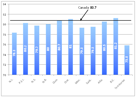
Like the previous, this chart has a non-zero axis and bars with distracting gradient fills. Blue, which in the previous chart represented females, now represents the combined metric. The chart also forces you to tilt your head to read abbreviated labels, though why Quebec had to be shortened while Territories remained uncondensed is anybody’s guess. Again the bar chart is a poor choice.
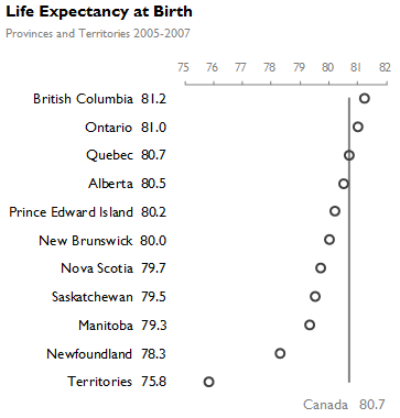
A simple dot plot does the trick, and with only one dimension it easily incorporates detailed value labels. Reorienting it horizontally allows us to avoid abbreviations and head-tilting while maintaining a smaller overall footprint. The comparison line for Canada from the original was a good idea and so it is reincorporated in our dot plot.
The other significant change is ordering the provinces by their values rather than geographically as in the previous chart. This provides the added element of rank without increasing the difficulty of finding a specific province.

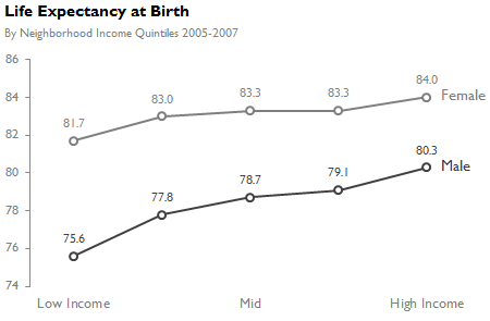
Life expectancy at birth, by sex, neighbourhood income quintiles, 2005–2007
The data in this chart is fairly straight forward, but in this case the categories are ordinal rather than nominal. That changes how we can show the data and even what conclusions we might try to draw. With ordinal data we are interested in both how males compare to females in each category, but also in the pattern of change across the income spectrum.

A simple line chart allows us to see the trend for both males and females easily. That the gap between males and female diminishes as income increases is clear, but what becomes more apparent is the steeper slope in both males and females when we go from Low to Low-Mid and from High-Mid to High. Colored labels can replace the legend making it even easier to read.
And for those who want the detailed labels
Excel makes it easy to create bar charts and add effects in an attempt spice it up, but time squandered on gradient fills could be better spent. Each of the redesigned charts was also made in Excel, but effort was focused on effectively communicating with the data, something Excel doesn’t always do by default.
With news of the cutbacks you might expect StatsCan folk to go to the bar more frequently, this report could do with fewer trips.