

Challenge
Can we bring more nuance and engagement to a static image of New York’s work and home populations?
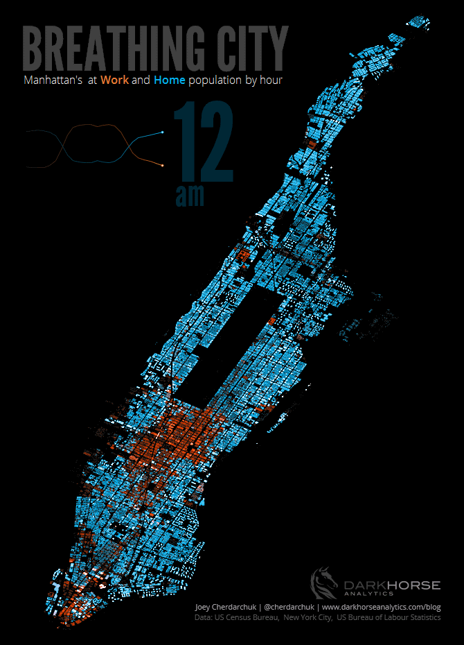
We were inspired by Conveyal’s description of their aggregate-disser tool which was used to visualize detailed information about where people were working and living in New York. We wanted to build on that, and bring to it a sense of the life and movement that happens throughout a day in Manhattan.
Solution
To recreate the static image we had to locate data on population, employment, land-use, and building footprints, and in the end write our own tool to combine the information. However, to create the sense of the flow over a 24 hour period required that we join that data with additional information on work activity and workday hours, in the end simulating the schedules of 3.5 million people living and working in Manhattan.
After running this simulation, we had a new data set to bring to life. A looping animated image seemed the best way to convey the cyclical nature of people’s daily migrations in the city. Combining a detailed map of the city with a population chart reminiscent of a heart monitor allowed us to visualize the pulse of the city.
Result
The project demonstrates how, with the right expertise, several disparate data sets can be pulled together to create something new and engaging, revealing patterns of movement which can’t be captured with a camera.
The visualization was viewed by millions and featured in several online news media outlets including Fast Company, the Huffington Post, the Daily Mail, and the Washington Post. The graphic was even shortlisted for an Information is Beautiful award.
Read more details about this project on the Darkhorse blog. If you are interested in doing similar work with our team please
