Our Portfolio of Projects
A selection of our public, non-confidential projects
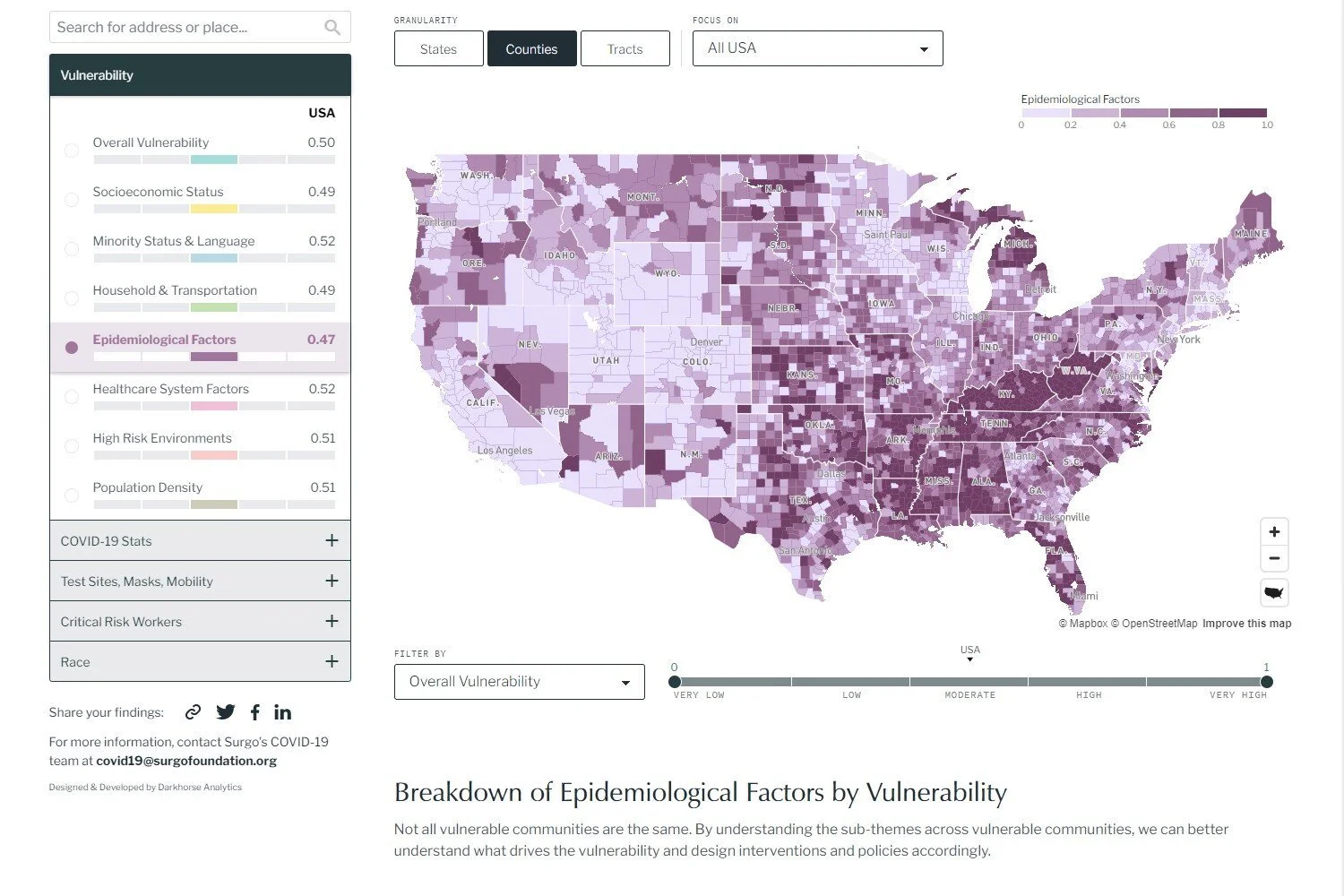
Using Data to Make an Impact on Societal Issues
By providing actionable insights through engaging visualizations, we help the stakeholders of our clients make critical decisions.

our work has been SHOWN in media coverage
Transforming Data to tell Complicated Stories assessable by your target audience
Storytelling with data is a mix of art and science, and one of the most effective ways of communicating insights.
We collaborated with the Economic Policy Institute to reimagine the State of Working America Data Library, empowering researchers, policymakers, and the public with the tools needed to understand and address the challenges facing America's workforce.
we’ve worked with various industries and clients
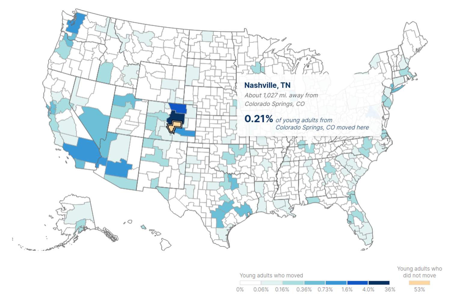
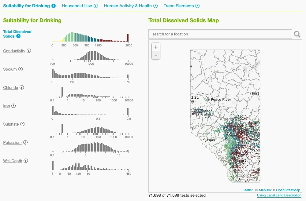
Creating Novel and Elegant Visual Interactive Powered by Complex Data
Sometimes, standard bar charts are not enough. We seek to create experiences that surprise and delight.
It can be especially difficult to find a suitable time to meet online when people live on different continents. This tool greatly simplifies this task.
Other Public Projects
How far do people relocate between childhood and young adulthood to gain employment opportunities? This project sheds light on migration patterns for different racial and socioeconomic groups in the United States.
What events coincided with the rise of certain chosen names? Walk through a data-driven narrative touring some interesting facets of this unique baby names data set.
Where is help most needed? The COVID-19 Community Vulnerability Index helps policy makers prioritize their interventions and maximize their impact on the most vulnerable populations.
How has our city grown? In a discussion around urban sprawl, this map was created to allow citizens to quickly see how the city has developed by animating in building rooflines according to the building’s year of creation.
A series of visualizations for the Alberta Environmental Public Health Information Network.
An interactive platform to visually compare property assessments at a building or parcel level throughout entire cities.
How much can I afford to borrow? What will my payments be? How long will it take me to pay it down? Get the answers.
A minimalist web application that creates choropleth maps by copy-pasting spreadsheet data.
An interactive visualization for filtering and comparing grades in schools across the province.
An animated visualization to create a sense of the life and movement that happens throughout a day in Manhattan.
An enchanting overview of the continuous and overwhelming amount of movement across the country.
An inventory planning and scheduling optimization to improve the efficiency and effectiveness of the harvest and transport plan for the pulp mill's logging operations.
Analytics Case Studies
An inventory planning and scheduling optimization to improve the efficiency and effectiveness of the harvest and transport plan for the pulp mill's logging operations.
A historical data mining and predictive analytics project to ensure the emergency services provider was deploying resources efficiently and wisely to meet demand.
A data mining and forecasting project to improve the Education Ministry's ability to attract, develop, and retain qualified teachers throughout the province.
A forecasting project to help the industrial equipment supplier better predict market demands to assist with inventory planning.